I went out to dinner with some close friends the other night, when the topic of music came up. We spent some time reminiscing about what we saw as the defining stages of our lives, and how our music tastes changed and developed along with us. Inspired by this conversation, I decided to see if I could take a more quantitative approach to analyzing this nostalgia. Conveniently, Spotify has been my main source of music for the last decade, and they both maintain their users’ lifetime streaming history and provide a convenient manner of downloading it. Thus, I set off to Tableau to see what I could learn about myself!
Below, you’ll find a summary of the insights I gained from working on this visualization. Afterwords, I spend some time going into the technical details of the project. I have included screenshots of my dashboard, but I encourage you to check out the interactive form on Tableau Public (it was a bit too slow when I attempted to embed it here). I’ve also included a link to some helper scripts on GitHub, which convert Spotify’s .json file into a spreadsheet and add genre information via the Spotify API.
My Highlights
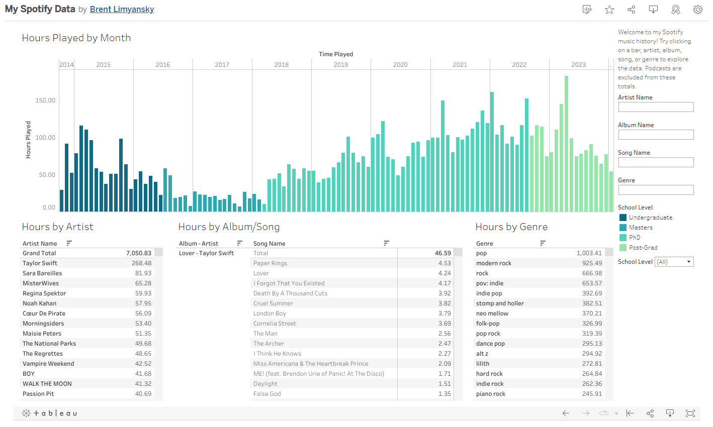
My favorite insight came from looking at my monthly streaming minutes, shown below. I color coded these months by the degree I was working on at the time. What stuck out to me was a decrease in listening time while I was working on my Master’s Degree, which ticked back up while working on my PhD.
An overview of my Tableau dashboard, showing a sharp decrease in listening while I was working on my Master’s Degree.
The two years I worked on my Master’s Degree were definitely the most social part of grad school. I was around others nearly all the time, either working on homework or TAing. Apparently I wasn’t selected to be DJ, accounting for the decrease in listening minutes compared to the end of my Undergraduate Degree. My PhD work was comparatively less social, with long hours spend on my computer while my friends were either doing the same or working in labs. Plenty of time to listen to music!

A selfie of the author grading tests with his classmates.
I also really liked using this dashboard to discover generas which, despite listening to, I didn’t know existed. For example, neo mellow was something I’d listened to quite a bit, yet I’d never heard of it before. Selecting it on my dashboard shows me my top neo mellow artists…
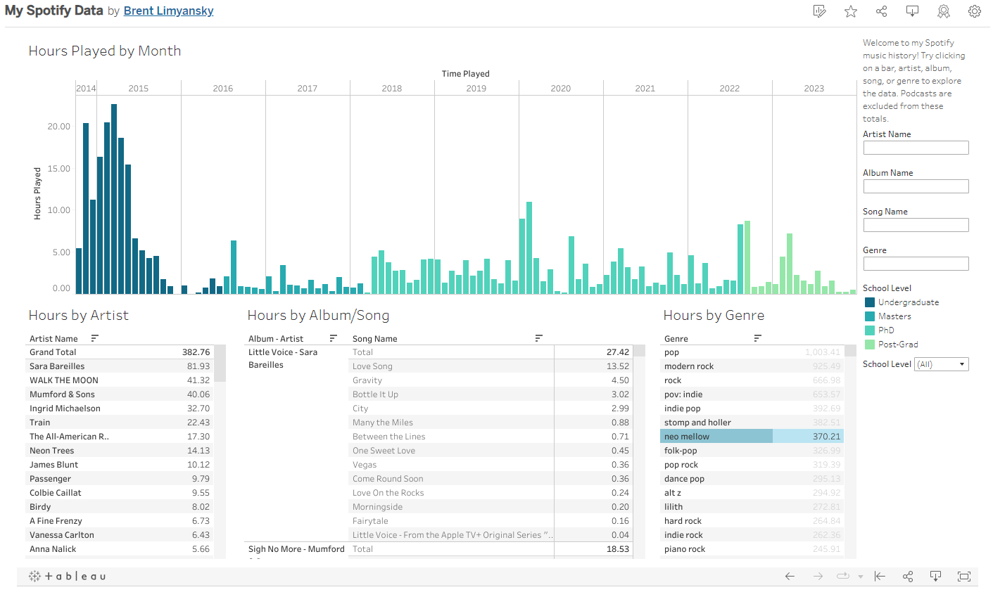
What is Neo Mellow?
and give me this fun moment where I thought to myself “now that you mention it, I kinda see what these guys have in common”.
Now, I’m searching neo mellow playlists on Spotify and finding new things to listen to!
Technical Details
Getting the Data from Spotify
Spotify is constantly gathering data about how you interact with their services. As a part of their data transparency policy, they will allow you to request this data so that you know exactly what it is they are collecting. The three types of user data you can download from Spotify are: account data, technical log information, and extended streaming history. There’s actually quite a lot of data they collect, which you can read about on their website.
This project utilized only the “extended streaming history” data set. This covers the lifetime of your account, and includes:
- Date/Time of Stream
- Number of milliseconds track was played
- Track name
- Artist name
- Album name
- Track URI (Spotify’s unique identifier)
- And More!
After requesting this data, it took about two weeks for it to be delivered. They guarantee the data within 30 days of request.
Most of the data I used in my dashboard was directly listed in the extended streaming history. However, while I think genre of music best tells the story of my music tastes, this isn’t included in your extended history! Which leads me to…
The Spotify API
If you aren’t familiar, API stands for “application programming interface”, and is a simple way for apps to talk to one another. For example, here’s an “API Endpoint” that asks the “REST Countries API” to give you information about Russia:
https://restcountries.com/v3.1/name/Russia
If you instead want to know information about Germany, you can change the address to:
https://restcountries.com/v3.1/name/Germany
The idea is that your program is able to ask simple questions in this format (“Tell me about Germany”), and get an answer that is easy for the computer to understand and work with.
The Spotify API is free, but does require you to make a developer account and generate some credentials for yourself before you can use it.
If you want a fun example of the kind of app you can build around this, check out statsforspotify.com.
After logging into your account, this website gives you details such as your top artists over a 4-week or 6-month time period, or the lifetime of your account.
Why only these time periods?
Well, the Spotify API has a get user’s top items function, which allows you to request a user’s most-streamed items over a short_term (4 week), medium_term (6 month) or long_term (all) time period.
In fact, after taking a minute to dig through the API documentation, we can see that Stats for Spotify is a minimalist wrapper around the larger Spotify API!
The downside to this, versus specifically downloading your data, is that your analysis is much more limited in scope. While your extended streaming data includes a timestamp for every play of every song you’ve ever listened to, there’s really no way to request that information through the API.
That’s a broad overview of API’s in general. In this project, I used the Spotify API to determine the genre of each song I had listened to. Specifically, I used the Spotipy python library to interact with the API. I first took each song’s unique URI and requested the unique artist URI’s associated with that song (note: although the downloaded data contains artist name, this is a plaintext “Taylor Swift”, and insufficient to actually query the API). Then, I used the artist URI to request the genre’s associated with that artist. Correlating this data, I wound up with a list of genres associated with each song.
There was a sneaky gottcha here - if a song was performed by, say, two “pop” artists, it gets two “pop” tags, and is counted in the genre total for “pop” twice!
In SQL, you’d correct for this with a GROUP BY command, but in Tableau I used a Level of Detail expression.
This is why you can select a genre on the dashboard, and the total will be different than the total for Hours by Artist.
While I was okay with saying “I listened to both Taylor Swift and Ed Sheeran for three minutes by listening to Everything has Changed”, I didn’t think it was fair to say I listened to six minutes of pop.
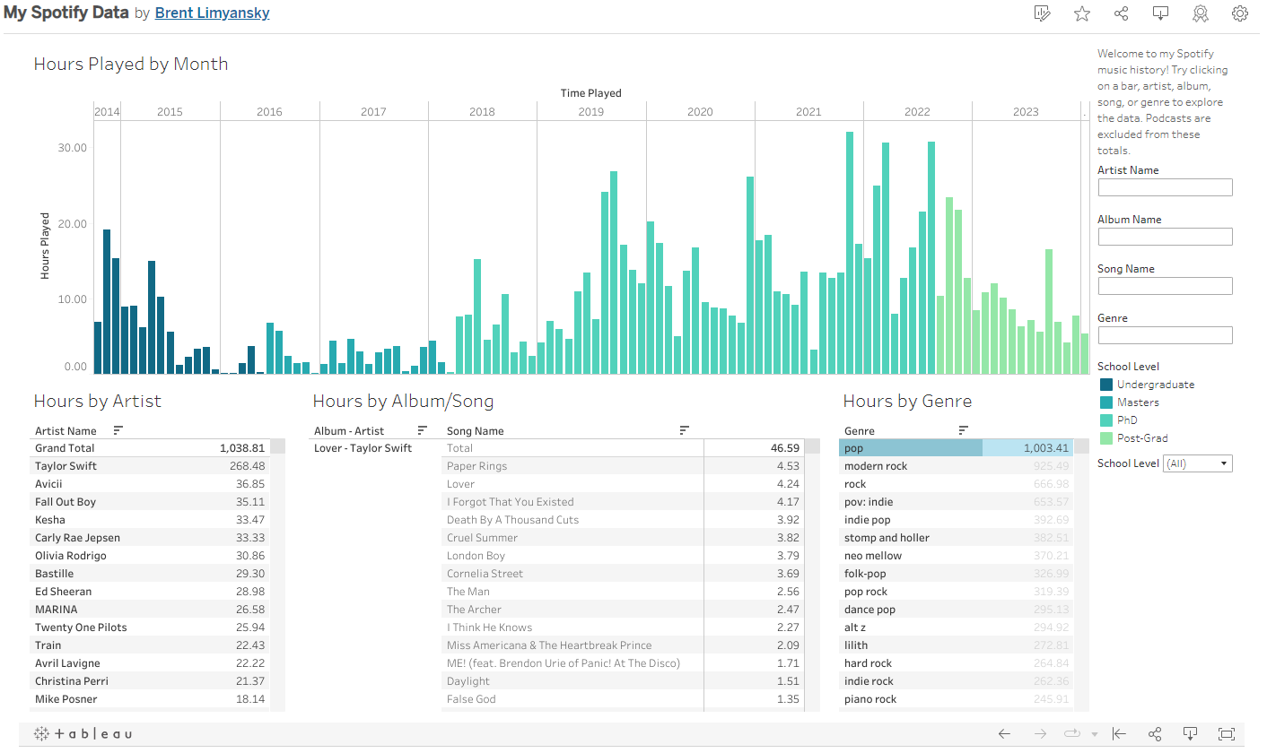 Double-counting artist collaborations mean I listened to 1,038 hours of pop artists, but only 1,003 hours of pop music.
Concluding Remarks
If you made it this far, thanks for reading! I had a lot of fun on this project, even if it took me quite a few months to finish the write-up. Moving forward, I’m looking into different ways to make this analysis available for other people to perform on their own. At the moment, I think this could involve making my own website that will plug user-submitted data into a Plotly dashboard. If this sounds like something you’d use, please let me know!